
Dulux Colour Awards' Grand Prix winner - green impact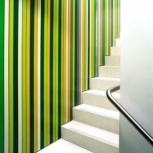 Green has made a statement in more ways than one, with the Carr Design Group making a colourful impact at this year's Dulux Colour Awards. Their submission, Deacon Law Tenancy in Sydney, was awarded the coveted Grand Prix title ahead of some of the highest-calibre finalists in the Awards' 22 year history. Using myriad Dulux colours, it also received the prize for the most outstanding Environmentally Friendly project, a category making its inaugural debut into this year's programme. Dulux's esteemed panel of judges, international guest interior designer Dr. Frederique Houssard-Andrieux, Cox Rayner's Michael Rayner and Jimmy Possum's Margot Spalding, commended the project for using colour to make a genuine impact. "Deacon Law Tenancy is a striking example of how a considerably large palette can be applied to a relative small area without having an overbearing impact on the space. It is truly an exhilarating approach to colour," judges said. Carr Design Group's success is rewarded with a business class return flight and accommodation to Milan for next month's highly-regarded Salone Internazionale del Mobile as part of a $15,000 prize pool, which includes $3,500 in cash. Drawing some of the most acclaimed architects and interior designers from around the country, 2008 reaffirmed the Dulux Colour Awards as the most prestigious program of its kind in Australia, with a commitment to fostering and celebrating the industry's creative use of colour. Held at Victoria Harbour's Dock 5, the venue was transformed exclusively for the evening from a raw space into a breath-taking display of colour. An installation of finalists illustrated the level of talent and prestige at this year's Dulux Colour Awards, which resulted in the following winners:
As part of their prize pool, all winners will now be exhibited at designEX. Overall, judges noticed a marked increase in interiors adopting more subdued combinations, often applying Dulux Namadji and Dulux White Watsonia as supporting colours for neutral colour schemes as well as backdrop colours to accentuate flashes of brightness. Feature colours tended to be applied with a fun new quirkiness that judges found particularly refreshing, but counselled against the occasional tendency to overpower with colour. Interestingly, the use of feature colours was a clear preference to overall 'whole-room' colours, with an abundance of red, orange and green in particular. Another trend noted was the application of colour to enhance internal features, using it to accentuate or showcase shape, highlight architectural uniqueness or to tattoo a space with individual personality. Please visit www.dulux.lookat.me.com.au for high-resolution imagery of winning entrants. 
|
03 9263 5678
|
Related News Articles
 Water Based Textured Paint Finish by
 Low Sheen Paint for Laundry Rooms by
 Acrylic Coating for Masonry Surfaces by
 Paint Hardener for Waste Disposal by
 2026 Colour Forecast by Dulux
 Waste Paint Hardener for Paint Disposal
 Low Odour Spray Paint by Dulux
 How to Dispose Old Paint by Dulux
 Advantages of Hiring Accredited Painters
 Long-Lasting Paint for Exterior Surfaces
 Paint Colour Consultation by Dulux
 Glitter Effect Spray Paint by Dulux
 Exterior Colour Schemes for Homes by
 Paint Calculator for DIY Projects by
 Choosing the Perfect White Paint with
 Wash&Wear® Low Sheen Paint from
 Water Based Paint for Tiles by Dulux
 2025 Colour Forecast by Dulux
 Anti-Scuff Low Sheen Paint for Walls
 Oil Based Enamel for Doors by Dulux
 |
 |
Home | About/Services | News Lounge | News Archive | Product Archive | Tender News | Testimonials | Conditions of Use | Privacy Policy
![]()
![]()
![]()
![]()
© SPEC-NET