
Creating Effective Signs from Architectural Signs Sydney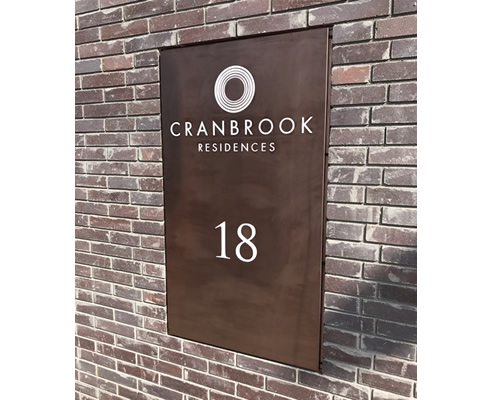 In this tech-centric, high-paced world, we're often talking about advertising and marketing online and over mobile. But when it comes to really grabbing people's attention, sometimes a good, old-fashioned sign can be your best bet. More than half of small-business owners find in-store signage and graphics effective in attracting customers, according to the results of a nationwide survey (*commissioned by FedEx Office US). The survey which polled more than 500 small businesses in the U.S. also showed that 64 percent of millennial small-business owners (age 18 to 34) place value on creativity in graphics and signage. By contrast, their baby boomer counterparts (age 55 and older) place higher emphasis on simplistic designs. Whatever your preferences, the way a sign is designed can have a significant influence on a company's ability to acquire new customers. Also 17 percent of its customers were people who did not intend to stop there but did so specifically because they saw the sign, which is well linked to their brand and overall marketing.
|
02 9680 2151 28/8 Victoria Ave, Castle Hill, NSW, 2154
|


Related News Articles
 UV Stable Vinyl for Vehicles by
 The Benefits of Sandblasting and Its
 Laser Cutting for Your Business from
 Laser Cutting Benefits from
 Customised Building Signage from
 Custom Desktop Bar by Architectural
 Building Signage for Businesses from
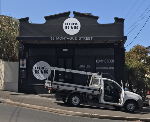
 Outdoor Signage from Architectural Signs
 Industry Signage from Architectural
 Custom Corporate Awards for McDonald's
 Name Badges for Staff and Offices by
 Directory for Hospitals and Clinics
 Benefits of Signage from Architectural
 Signage for Beauty and Skincare from
 Seasonal Signage Ideas from
 Long Service Recognition and Specific
 Corporate Awards Customised by
 Sports Signage from Architectural Signs
 Brass Engraving NSW by Architectural
 Safety Signage for Building and
 |
 |
Home | About/Services | News Lounge | News Archive | Product Archive | Tender News | Testimonials | Conditions of Use | Privacy Policy | Stats
![]()
![]()
![]()
![]()
© SPEC-NET